8 minutes
CSS for JS Notes (1)
Course: CSS for JS
Module 0 - Fundamentals
Media Queries
/* CSS */
@media (condition) {
  /* Some CSS that'll run if the condition is met. */
}
Hiding content
It’s common to use media queries to have alternative interfaces depending on the screen size.
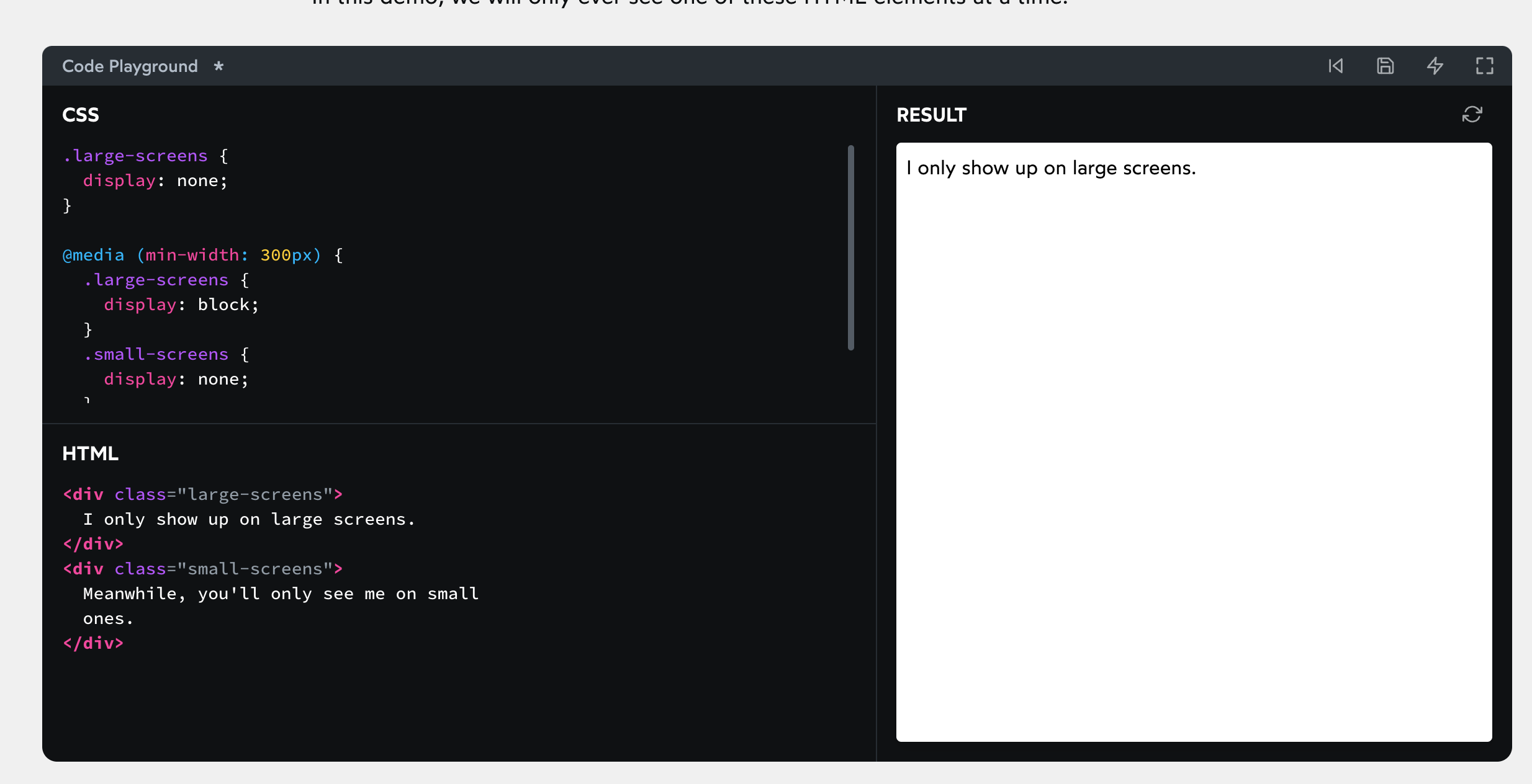
display: none is a declaration that removes an element from the rendering process; it’s as if it doesn’t exist.
By default, we’ll hide any elements with the large-screens class.
If our window is at least 300px wide, however, we apply special overrides. This includes showing large-screens elements, and hiding small-screens elements.
This trick is often used for navigation. Desktop users see a list of links, whereas mobile users see a hamburger icon.
Selectors
Pseudo-classes
Pseudo-classes let us apply a chunk of CSS based on an element’s current state. In this case, we’re adding a blue text color when the element is hovered.
/* Any button over which the user's pointer is hovering */
button:hover {
  color: blue;
}
focus
The :focus pseudo-class allows us to apply styles exclusively when an interactive element has focus:
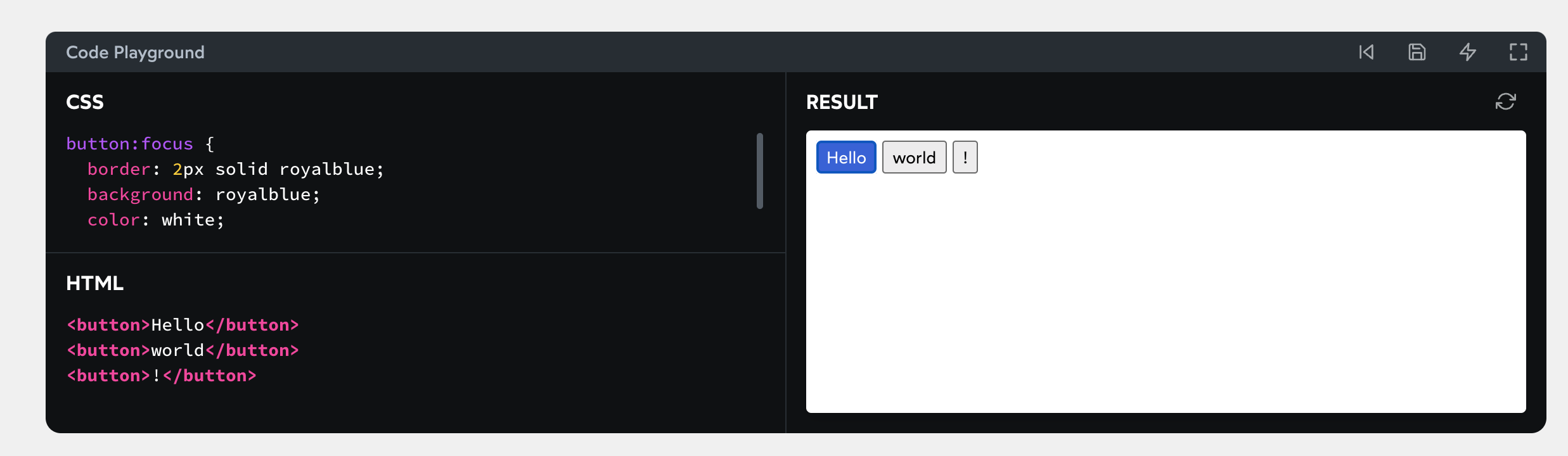
Focus styles are primarily useful for folks who don’t use a “pointer-style” input device (like a mouse, a trackpad, or a finger on a touchscreen). The focus styles show you where you are on the page, which element is selected.
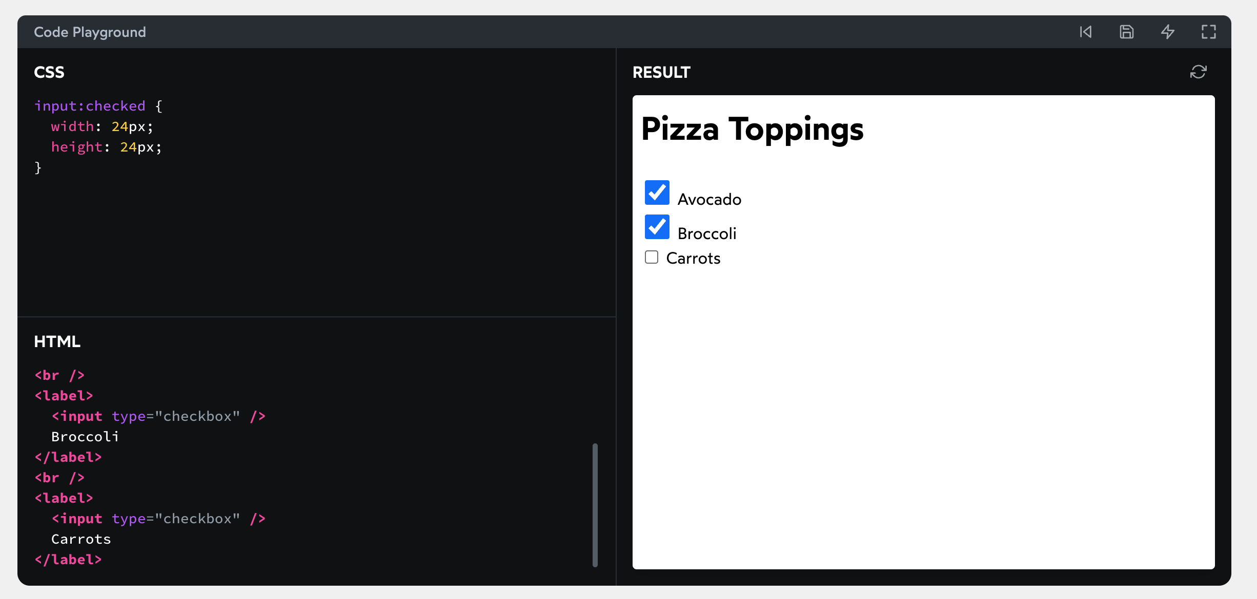
checked
The :checked pseudo-class only applies to checkboxes and radio buttons that are “filled in”. You can apply additional styles to indicate that the input is activated:
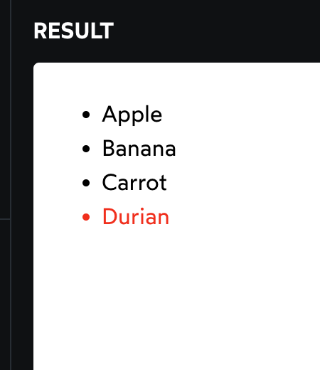
first/last-child; first/last-of-type
li:last-child {
  color: red;
}
:first-of-type depends on the type of the HTML tag. For example, let’s suppose we have the following setup:
<style>
  p:first-child {
    color: red;
  }
</style>

<section>
  <h1>Hello world!</h1>
  <p>This is a paragraph!</p>
  <p>This is another paragraph!</p>
</section>
The first child within the parent <section> tag is an <h1>. Our p:first-child is looking for situations where a paragraph is the first child within a parent container. It doesn’t work in this case.
But, if we switch the selector to p:first-of-type, it does work:
<style>
  p:first-of-type {
    color: red;
  }
</style>

<section>
  <h1>Hello world!</h1>
  <p>This is a paragraph!</p>
  <p>This is another paragraph!</p>
</section>
The :first-of-type pseudo-class ignores any siblings that aren’t of the same type. In this case, p:first-of-type is going to select the first paragraph within a container, regardless of whether or not it’s the first child.
Pseudo-elements
In terms of syntax, pseudo-elements use two colons instead of one (::), though some pseudo-elements also support single-colon syntax.
before and after
Two of the most common pseudo-elements are ::before and ::after.
<style>
  p::before {
    content: '→ ';
    color: deeppink;
  }

  p::after {
    content: ' ←';
    color: deeppink;
  }
</style>
In general, we probably shouldn’t use these two pseudo-elements. In a vanilla HTML/CSS world, it can be helpful to “bundle” content in with a CSS selector. In the era of components, however, we have better ways of bundling content.
There are also some accessibility concerns with ::before and ::after. Some screen readers will try to vocalize the content. Others will ignore them entirely. This inconsistency is problematic.
That said, if the effect is entirely decorative (eg. colorful shapes), I believe it’s fine to create them with an empty content string:
<style>
  p::before {
    content: '';
    display: block;
    width: 32px;
    height: 32px;
    border-radius: 50%;
    background-color: peachpuff;
    margin: 8px;
  }
</style>

<p>
  This paragraph has a decorative circle.
</p>
Combinators
In CSS, we can differentiate between children and descendants. Think of a family tree: a child is only one level down from the parent. A descendant might be 1 level down (child), 2 levels down (grandchild), 3 levels down…
What if we only want to target children, and not deeper descendants? Using > will apply the style on the child only.
<style>
  li {
    margin-bottom: 8px;
  }

  .main-list > li {
    border: 2px dotted;
  }
</style>

<ul class="main-list">
  <li>Salt</li>
  <li>Pepper</li>
  <li>
    Fruits & Veg:
    <ul>
      <li>Apple</li>
    </ul>
  </li>
Module 1 - Rendering Logic I
box-sizing: content-box /*default*/
box-sizing: border-box;
The Box Model
Winter Layers
The four aspects that make up the box model are:
- Content
- Padding
- Border
- Margin
Padding
Many developers believe that pixels are bad for accessibility. This is true when it comes to font size, but pixels are the best unit to use for padding (and other box model properties like margin/border).
Shorthand properties
.two-way-padding {
  padding: 15px 30px;
}

.asymmetric-padding {
  padding: 10px 20px 30px 40px;
}
If two values are passed, the first value is used for both vertical directions (top/bottom), and the second value is used for horizontal directions (left/right).
If all 4 values are passed, it applies them in a specific order: top, right, bottom, left.(clock-wise direction)
When fewer than 4 values are passed, it “fills in the gaps”. If you pass it two values, it mirrors the top to the bottom, and the right to the left. With only 3 values, we set top/right/bottom explicitly, and mirror the right value to the left.
Beyond padding
This pattern is shared amongst other CSS properties that have shorthand values. For example:
- margin (
margin: 10px 20px 30px 40px)- border-style (
border-style: dotted solid dashed solid)
Border
There are three styles specific to border: width, style, color; the only required field is border-style. Without it, no border will be shown!
If we don’t specify a border color, it’ll use the font’s color by default. This isn’t well-known, but it can be useful in cases where those things should be synchronized!
.box {
  width: 100px;
  height: 50px;
  border: 4px solid;
}

.box.one {
  /*
    Setting TEXT color,
    not border color, but border color goes the same with the text color.
  */
  color: hotpink;
}
Border radius
It actually means corner radius.
You can also use percentages; 50% will turn your shape into a circle or oval, since each corner’s radius is 50% of the total width/height:
.box {
  width: 100px;
  height: 100px;
  border: 4px solid hotpink;
  border-radius: 50%;
}
Border vs. Outline
A common stumbling block for devs is the distinction between outline and border. In some respects, they’re quite similar! They both add a visual edge to a given element.
The core difference is that outline doesn’t affect layout. Outline is kinda more like box-shadow; it’s a cosmetic effect draped over an element, without nudging it around, or changing its size.
Outlines are stacked outside border, and can sometimes be used as a “second border”, for effect:
.box {
  width: 100px;
  height: 100px;
  border: 4px solid darkviolet;
  outline: 4px solid deeppink;
}
A couple more quick tidbits about outlines:
- Outlines will follow the curve set with
border-radiusin all browsers except Safari. This is a recent change; before September 2021, most browsers kept outlines straight and boxy. - Outlines have a special
outline-offsetproperty. It allows you to add a bit of a gap between the element and its outline.
Margin
Negative margins can also pull an element’s sibling closer.
It’s easy to fall into the trap of thinking that margin is exclusively about changing the selected element’s position. Really, though, it’s about changing the gap between elements. Negative margin shrinks the gap below an element, causing the next element to scoot up closer.
Auto Margins
The auto value seeks to fill the maximum available space. It works the same way for the width property.
.content {
  width: 50%;
  margin-left: auto;
  margin-right: auto;
  background: palevioletred;
  padding: 16px;
}
When we set both margin-left and margin-right to auto, we’re telling them each to take up as much space as possible.

Two caveats:
- This only works for horizontal margin. Setting top/bottom margin to
autois equivalent to setting it to0px*. - This only works on elements with an explicit width. Block elements will naturally grow to fill the available horizontal space, so we need to give our element a
widthin order to center it.
Flow Layout
Flow layout is the default layout mode. Everything we’ve seen so far has used Flow layout. A plain HTML document, with no CSS applied, uses Flow layout exclusively.
I like to think of Flow layout as the “Microsoft Word” layout algorithm. It’s intended to be used for document type layouts.
There are two main element types in Flow layout:
- Block elements: things like headings, paragraphs, footers, asides. The chunks of content that make up a page.
- Inline elements: things like links, or a string of bold text. Generally, inline elements are meant to highlight bits of text, or elements within a block container.
Each HTML tag has a default type. <div> and <header> are block elements, span and <a> are inline elements.
We can toggle any particular element with the display property:
/* Transform a particular <a> tag from `inline` to `block`: */
a.nav-link {
  display: block;
}
Block level elements:
What if we force it to shrink down to the minimum size required for the letters? We can do this with the special width keyword fit-content*:
h2 {
  width: fit-content;
  border: 2px dotted;
}
Inline level elements:
It has “extra space” for free - the browser treats inline elements as if they’re typography.
There are two ways we can fix this problem:
- Set images to
display: block— if you’re noticing this problem, there’s a good chance your images aren’t interspersed with text, so setting them to display as blocks makes sense. - Set the
line-heighton the wrapping div to0.
Inline elements can line-wrap
Inline elements have one pretty big trick up their sleeves; they can line-wrap.
Inline-block doesn’t line-wrap

You may be tempted to pick really-short link text, to avoid this problem, but that would be a mistake; descriptive link text is important for accessibility.
Width Algorithms
width: max-content
width: min-content
width: fit-content